 MaxLananas
iProf 2026
On this page
Interface study · Personal redesign
Make the next useful action easier to find.

iProf 2026 explores a clearer staff portal through a personal interface redesign. The presentation is set in the context of the Guadeloupe education authority, with fictitious demonstration data. My focus is the relationship between a person’s current situation, their next deadline and the documents or conversations they need.
- Role
- Interface redesign and presentation by MaxLananas
- Technical context
- PHP, CSS and JavaScript — stack stated in the supplied presentation
- Presented material
- 11 presentation visuals and a 47.68-second walkthrough
The design question
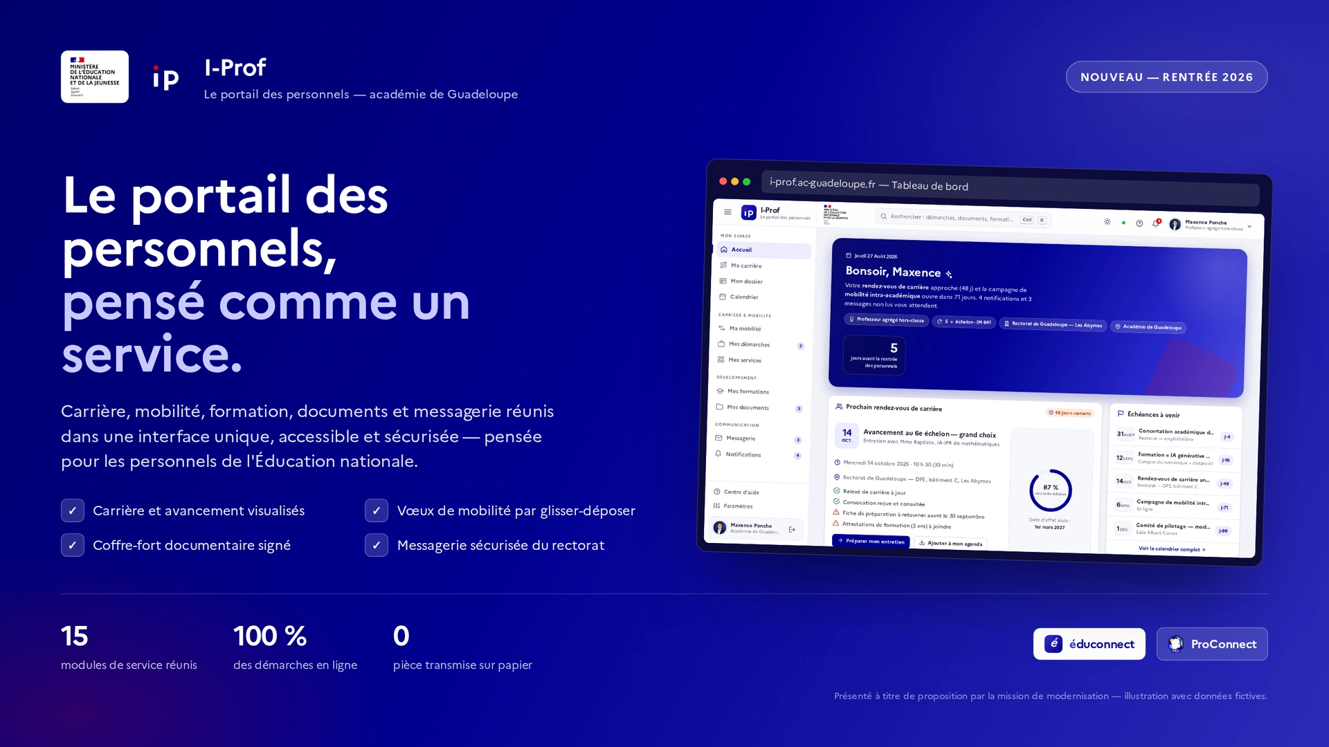
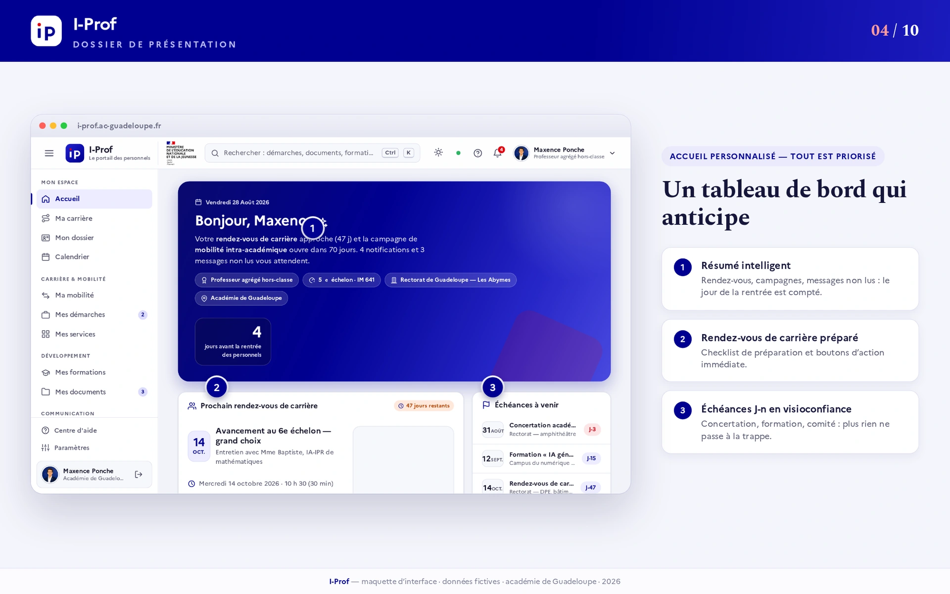
Career, mobility, documents and messages are different tasks, but they concern the same person. The design question is how to connect those tasks without making every screen compete for attention. The supplied dashboard answers with a short situation summary, the next career appointment and a small set of upcoming deadlines before the rest of the navigation.
01 — Orient before asking the user to navigate
The dashboard brings the current role, unread information and upcoming events into one hierarchy. A career appointment is treated as an actionable item rather than another number in a menu. This establishes a clear entry point while the persistent sidebar keeps the other services available.
02 — Give time and priorities a visible shape
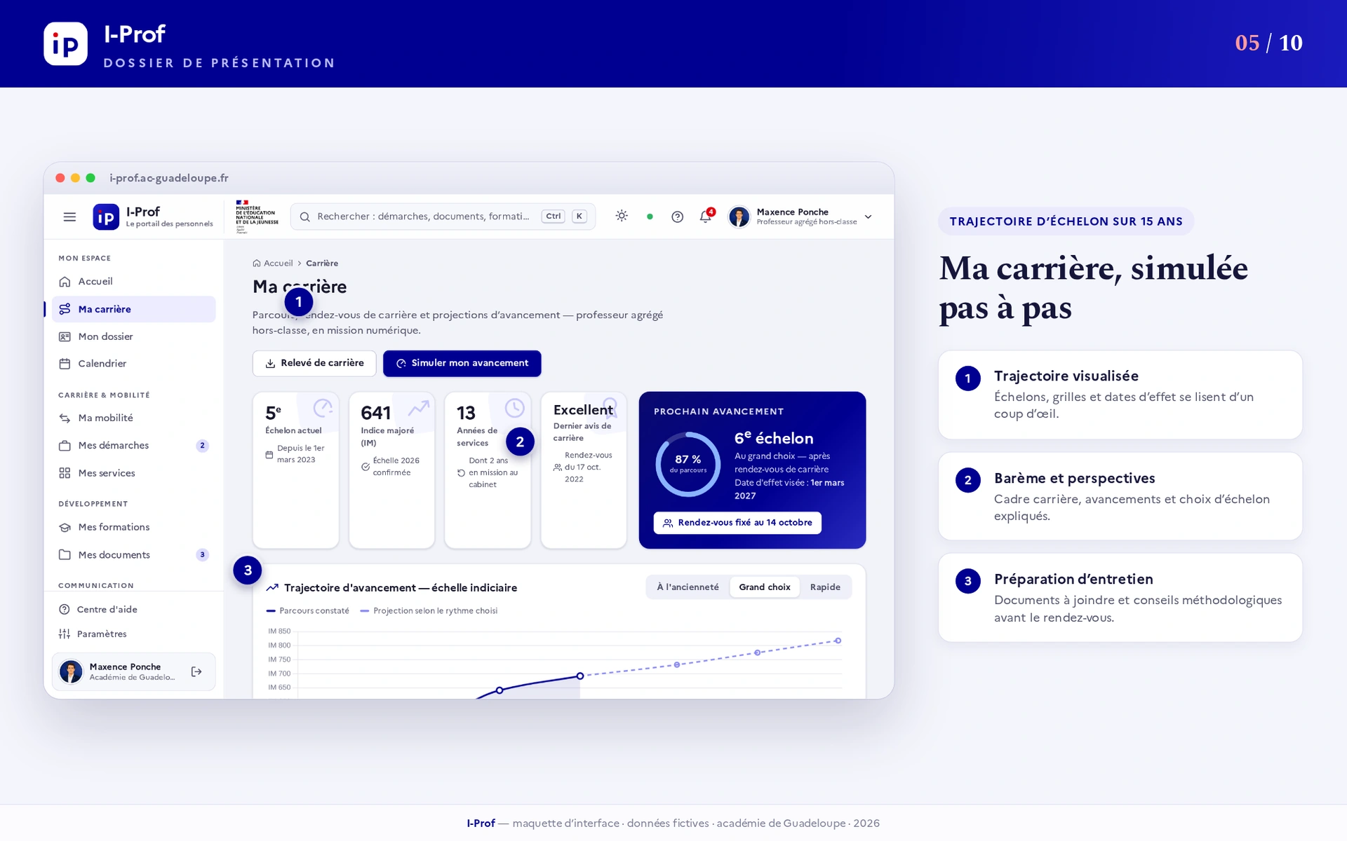
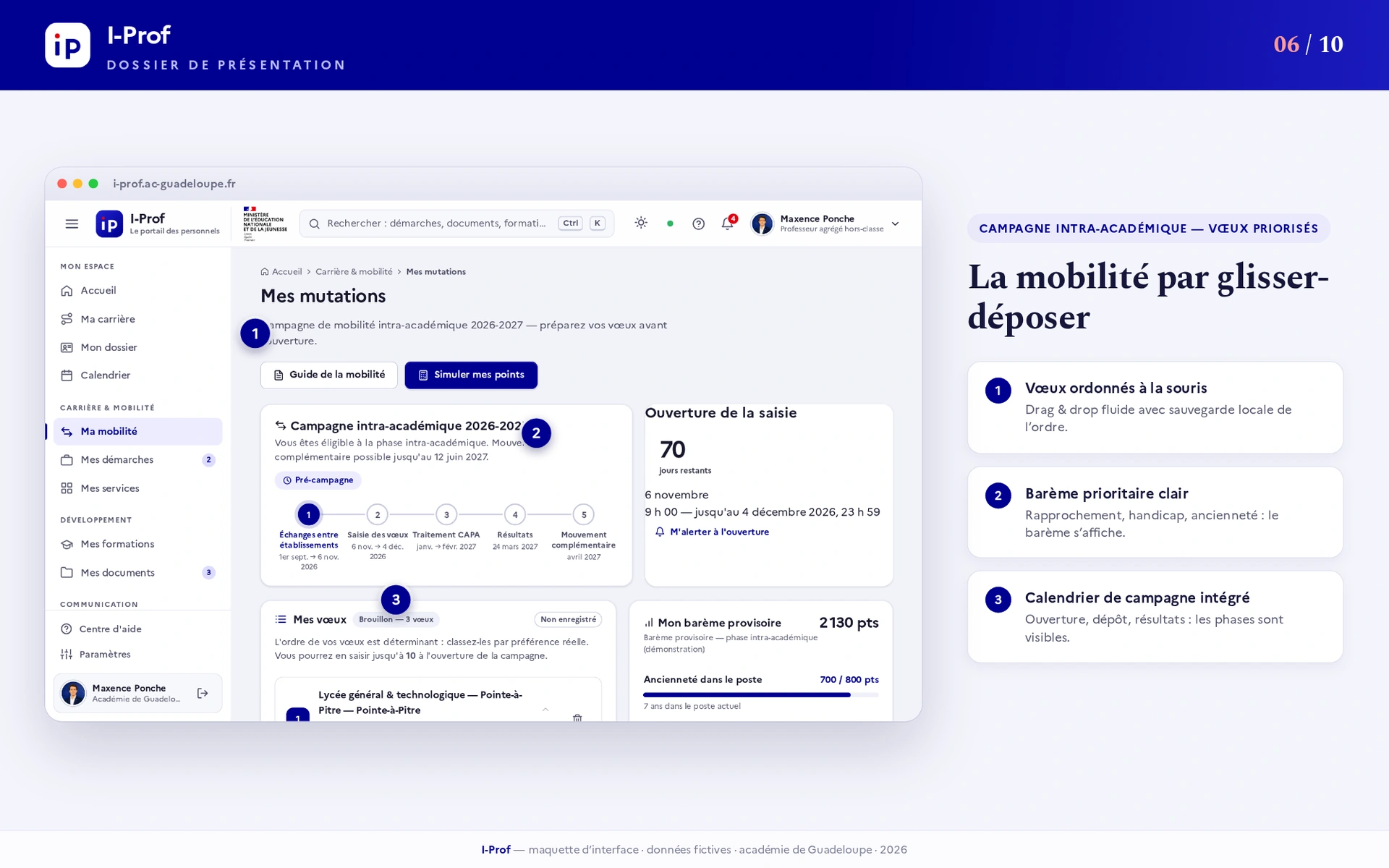
The career view uses a timeline and a next-step card to make progression easier to read. The mobility presentation complements it with an ordered list of preferences, campaign information and a calendar. These are complementary views of a process, not evidence that the underlying career calculations or administrative rules have been validated.

03 — Keep supporting information close to the task
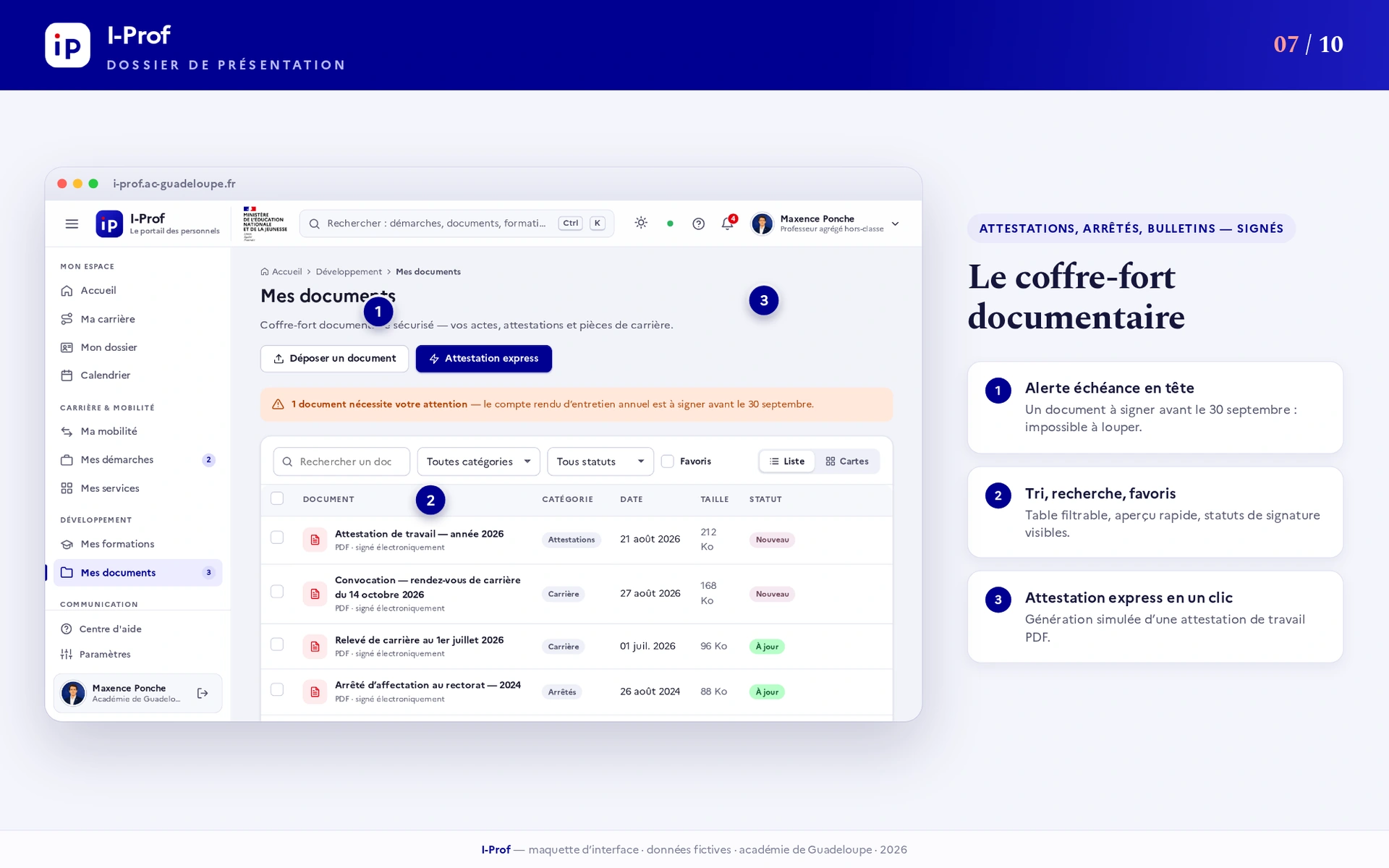
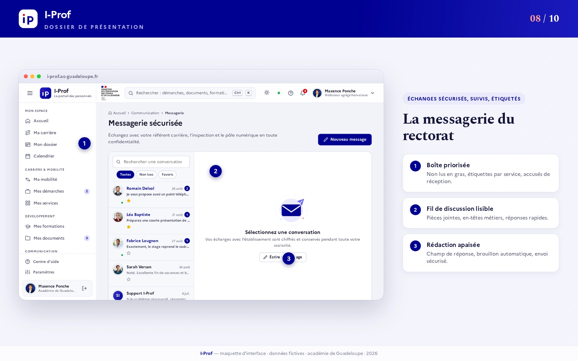
Documents are organized around categories, search and visible status. The messaging screen follows the same logic with a prioritized inbox and conversation threads. The point is to reduce the need to reconstruct context when moving from a deadline to a document or a message.

A shared visual language, not eleven unrelated screens
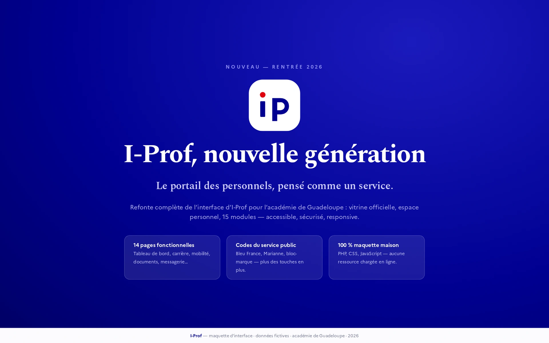
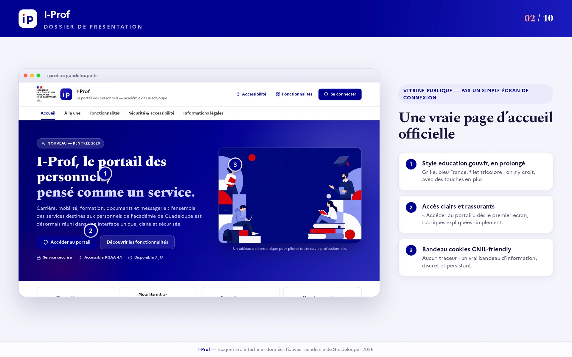
The supplied presentation uses a blue-led palette, restrained surfaces, persistent navigation and a repeated card hierarchy. Typography separates the page’s purpose from operational information. These public-service visual references remain inside the independently supplied mockups; this portfolio is not an official Ministry website.
Responsive and accessible by intention — testable in implementation
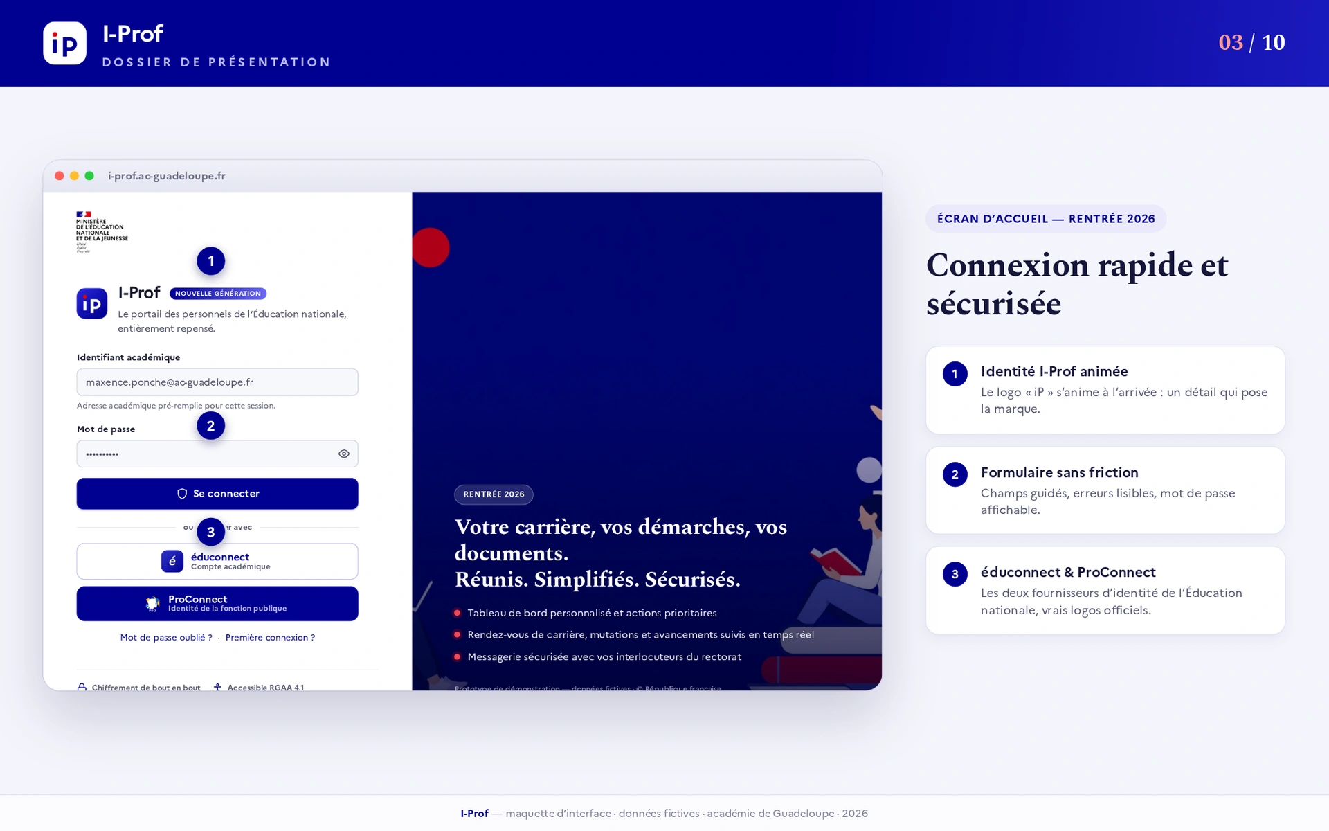
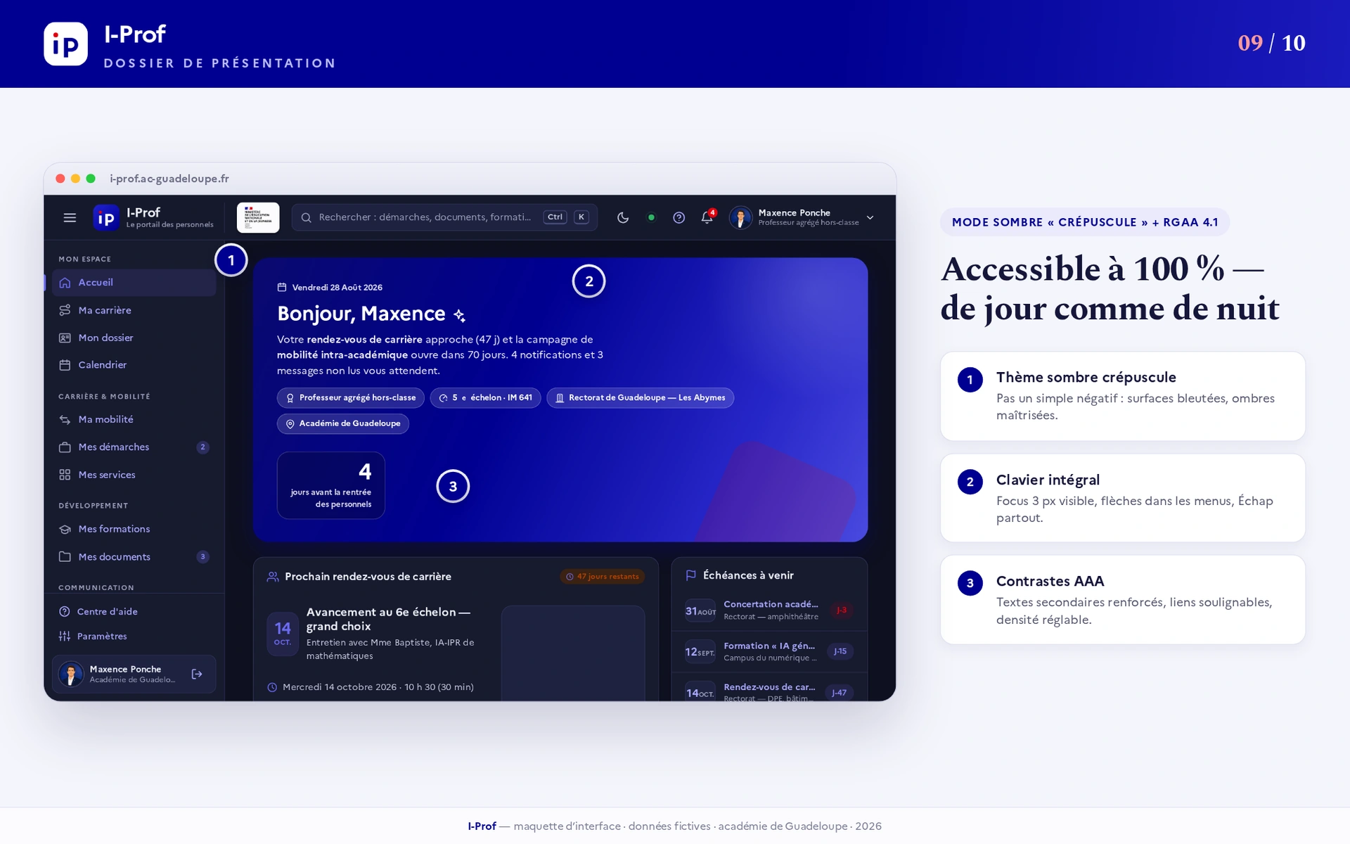
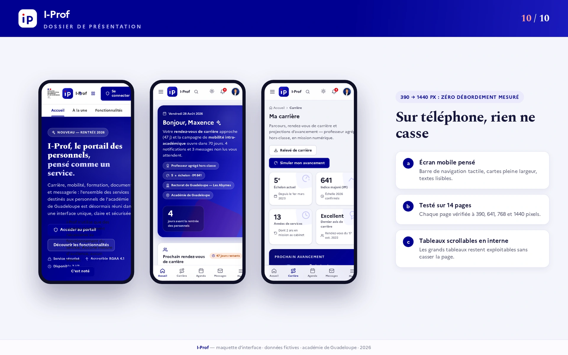
The mobile and dark-theme presentations show how the same information hierarchy can adapt to narrower screens and another contrast context. They are useful design evidence, but a screenshot alone cannot establish keyboard behavior, assistive-technology support, secure authentication or RGAA conformance.


What a production handoff should verify
- Keyboard order, visible focus, useful form labels and an alternative to pointer-only reordering.
- Reflow at narrow widths and high zoom without losing actions or document information.
- Empty, loading, error and expired-document states rather than the ideal data state alone.
- Server-side authorization, session handling and real administrative rules with the responsible team.
- Usability with the intended staff and an accessibility audit of the implemented application.
The complete presentation
The eleven supplied visuals remain available below, including the public-facing page, sign-in concept, dashboard, career, mobility, documents, messages and responsive/accessibility presentations. Open an image for a larger view. The video uses the browser’s native player and is not downloaded before playback is requested.
Watch the redesign
Independent presentation with fictitious data. The native player needs no iframe or Google connection to play the video.
Open the video file · 1280 × 720 · 47.68 seconds · Loaded on request
Text description of the on-screen sequence
The film opens with public-service visual references and the iProf title. It then shows the dashboard and its deadlines, the career view and its progression, followed by the public-facing page. It ends with the presentation summary. Figures and claims visible in the film belong to the supplied mockup, not measured usage results established by this case study. This describes the images, not a transcription of the audio track.
Explore the eleven visuals
Select an image to enlarge it. Keyboard arrows move through the presentation; the displayed data is fictitious.
Scope and evidence
The project is presented as a personal interface redesign with fictitious data. This page does not claim institutional commissioning, production deployment, measured business results or independently certified accessibility. The supplied media is the evidence available for this study; the underlying iProf application code was not provided for review.
Supplied presentation and original files · Sources reviewed .
MaxLananas · Interfaces & tools
Have an interface worth rethinking?
A useful starting point is the task that currently causes friction: finding an action, understanding a status or moving between related information. Describe that context and the intended audience when getting in touch.